
[CV] Understanding of CNN via visualization
In this post we will discuss about how to understand and visualize what CNN learned including nearest neighbor method, saliency map, feature visualization and attention.
So our goal is to demystify what sort of knowledge has been learned and discovered in the features of trained CNN. And from this, we expect that it allows us to
- Interpret what neural nets pay attention to
- Understand when they’ll work and when they won’t
- Compare different models and architectures
- Manipulate images based on convolutional network responses
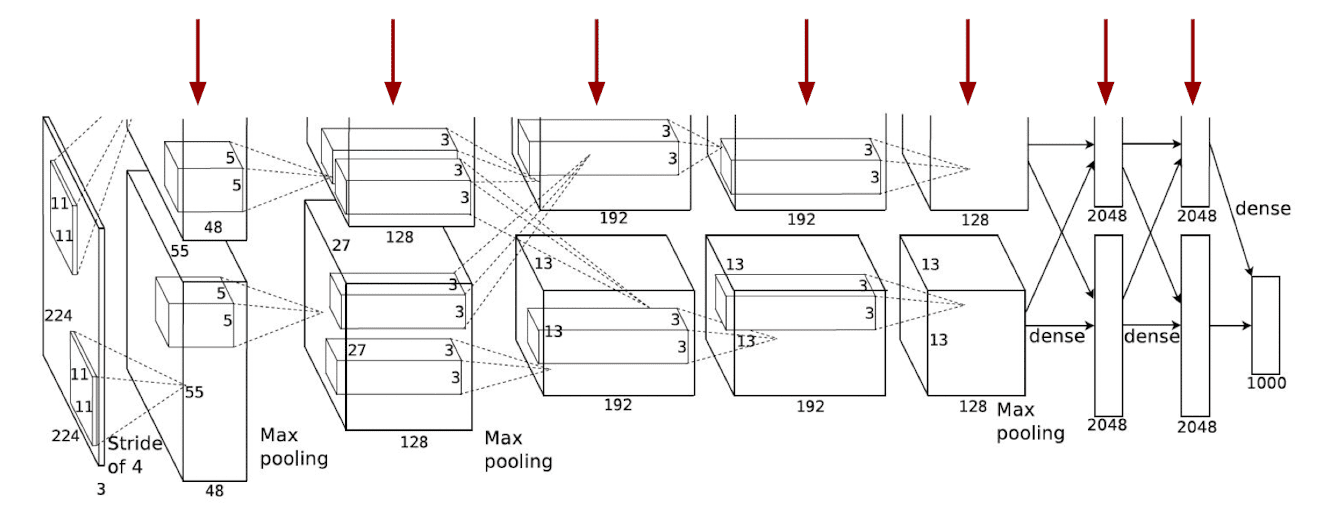
$\mathbf{Fig\ 1.}$ Visualization of CNN
Obviously it is not very straightforward to us because the intermediate features of deep neural network usually reside in a high-dimensional space, e.g. $256 \times 13 \times 13$. Then how do we visualize these high dimensional features in a human-understandable way?
Visualization of filters
But some features are already straightforward to visualize and that is the filters learned the very lower layers.
In the case of AlexNet, it has $96$ number of filters with size of $11 \times 11$ and takes an input of channel $3$ at the lowest layer. Thus we can interpret these filters as $96$ RGB images with size of $11 \times 11$ pixels:
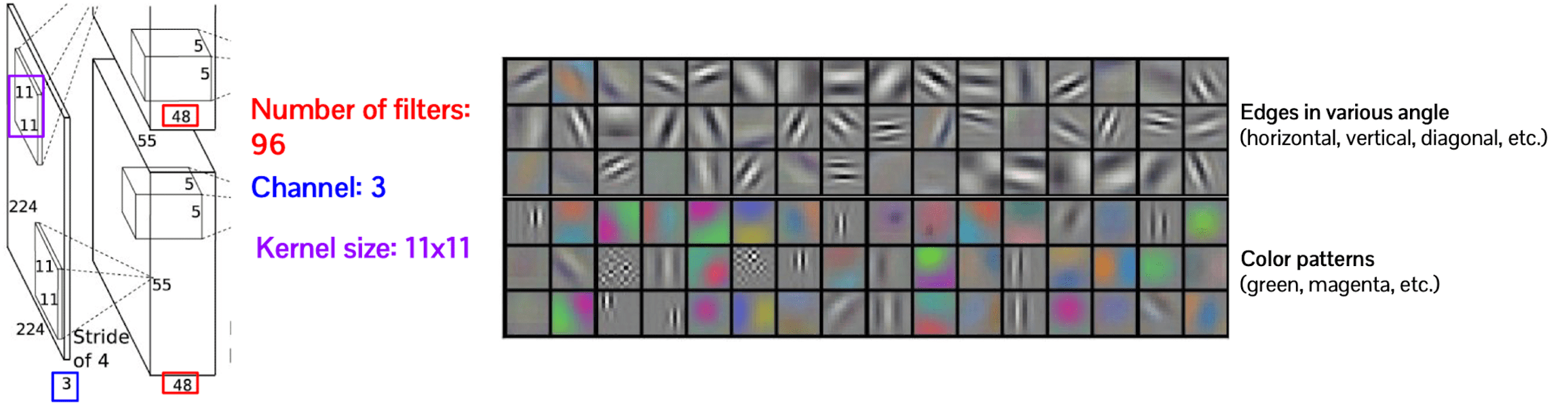
$\mathbf{Fig\ 2.}$ Visualization of filters in the first layer of AlexNet
In the aftermath of visualization, now it is discovered that the first layer of the convolution neural networks captures some low level visual primitives such as edge and color patterns.
Visualization of activations based on examples
Activation map
For the next step let’s try to visualize the deeper layer feature, for instance the second layer feature of which the size is $256 \times 27 \times 27$. It is possible to envision the high-dimensional features with more than $3$ channels as a gray scale images, i.e. in case of second layer it is $256$ number of gray scale images with $27 \times 27$ pixel size.
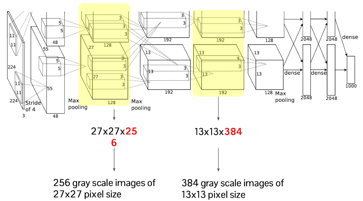
$\mathbf{Fig\ 3.}$ The way of interpretation for intermediate activation maps of AlexNet
And the results of visualization are shown in the following figures. First of all, we see that the output of the first convolution layer after pooling has much lower resolution than original input and it is highly activated around the boundary appearance of object.
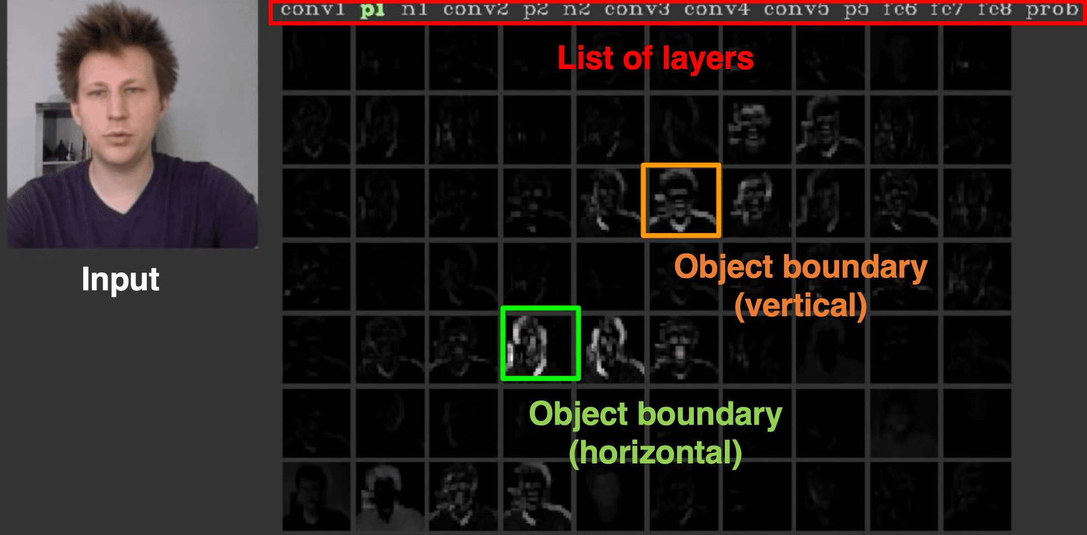
$\mathbf{Fig\ 4.}$ Conv1 feature map in AlexNet (credit: Jason Yosinski)
In the higher layers, layers focus on the higher level of semantic groups such as skin colors to discover more common patterns even from some irrelevant classes and thus features are much sparse than features in the lower layer. Another interesting aspect of these hierarchical extraction is, the higher layer can aggregate the local feature from the lower layer.
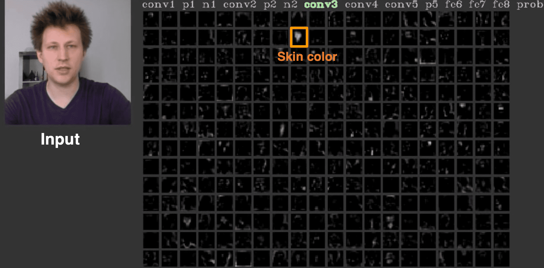
$\mathbf{Fig\ 5.}$ Conv3 feature map in AlexNet (credit: Jason Yosinski)
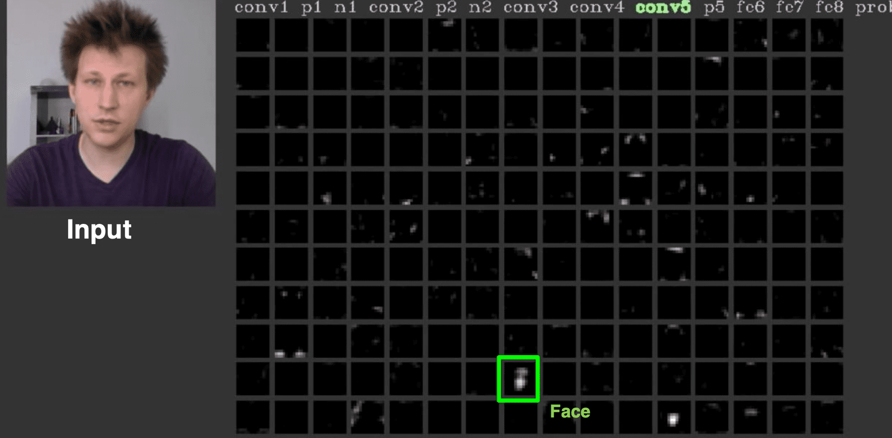
$\mathbf{Fig\ 6.}$ Conv5 feature map in AlexNet (credit: Jason Yosinski)
Yosinski et al. found that much of the lower layer computation of ImageNet pretrained AlexNet is more robust to the input while the last three layers are sensitive. Although the class labels of ImageNet
contain no explicitly labeled faces, the network learns itself to identify faces of objects for later downstream task, classification.
$\mathbf{Fig\ 7.}$ 151th filter of conv5 layer does the face detection (source: [3])
Maximally activating patches
The other way to visualize CNN is just visualize maximally activating patches. It is very similar idea we just discussed before. But instead of figuring out the feature, for more intuitive visualization we may feed entire training images into the network one by one and see which images are activating that channel of feature.
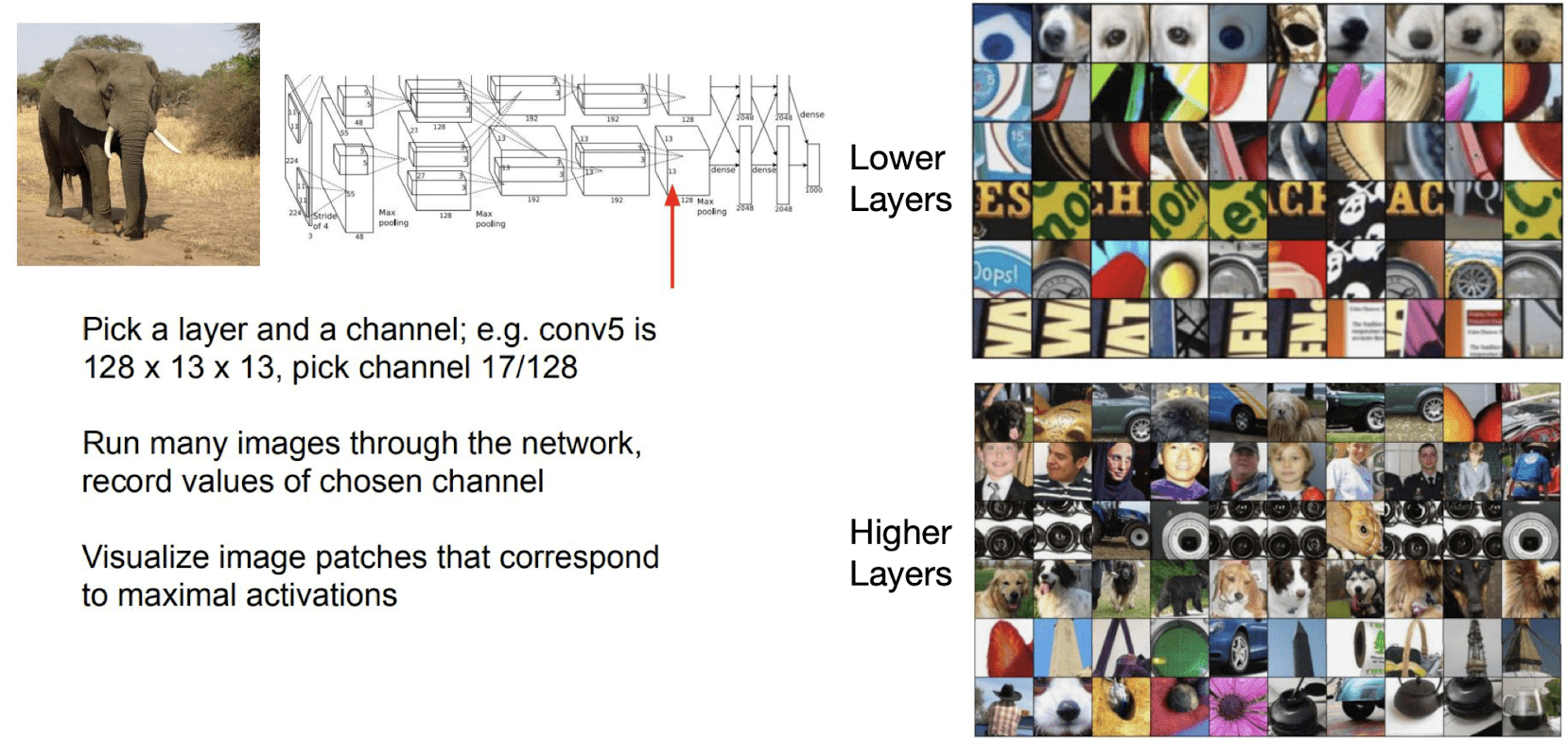
$\mathbf{Fig\ 8.}$ Visualizing Maximally activating patches (source: [1])
Column dimension corresponds to certain channels in the neural network and each row is the collection of images that activate the corresponding channel the most from the training set.
At the lower layer, the neurons are fired around some lower level visual primitives. However at the higher layers, it is activated over more high level semantics. For instance, the 2nd row of higher layer part is activated for the face images and similarly the 4th row is activated around some texture patterns that indicate the dog. And obvisouly, these hierarchical abstractions depend in part on the size of the receptive field.
Saliency map
So far all of this observations show us what kind of features are learned in the neural network. The more direct way to visualize which part of an image contributes the most to make a prediction.
The intuition of the procedure is quite straightforward: if you change certain pixel and the score of the corresponding class is not sensitive, then one can say that that pixel does not contribute to that class classification.
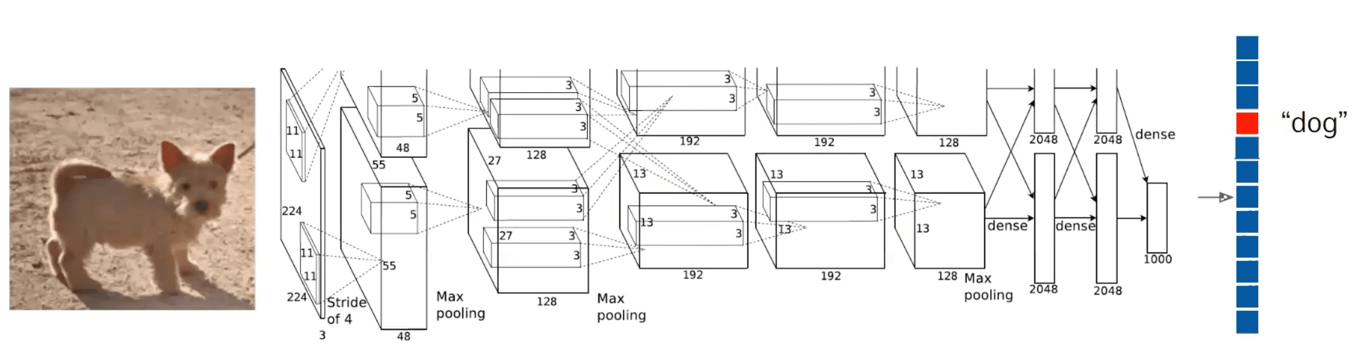
$\mathbf{Fig\ 9.}$ Classification task (source: [1])
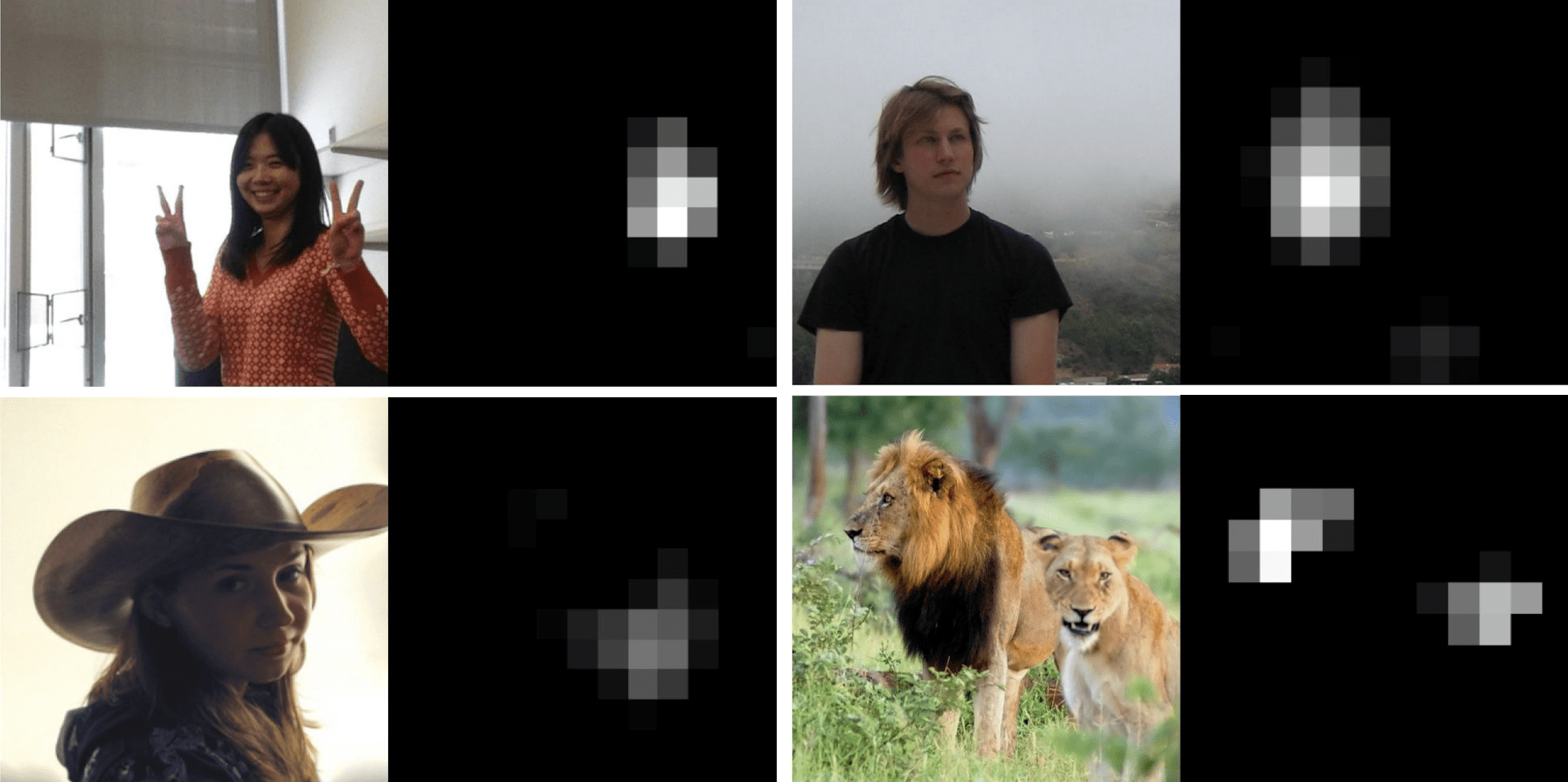
First, we feed this input data $I$ to the neural network $S_c$ and get the output score of class $c$, $S_c (I)$. Then, the gradient $\frac{\partial S_c(I)}{\partial I}$ of which size coincides with $I$ indicates the sensitivity of the score with respect to the changes in the pixels of $I$. And this gradient map is referred to as saliency map.
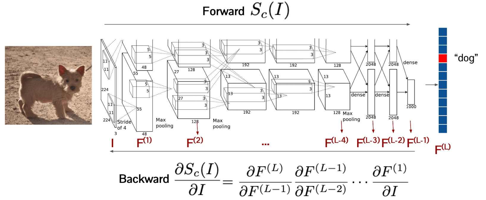
$\mathbf{Fig\ 10.}$ Calculating saliency map (source: [1])
Some examples of visualizing the saliency maps are outlined below. We can observe that maps have a large values around the actual object that corresponds to the class label.
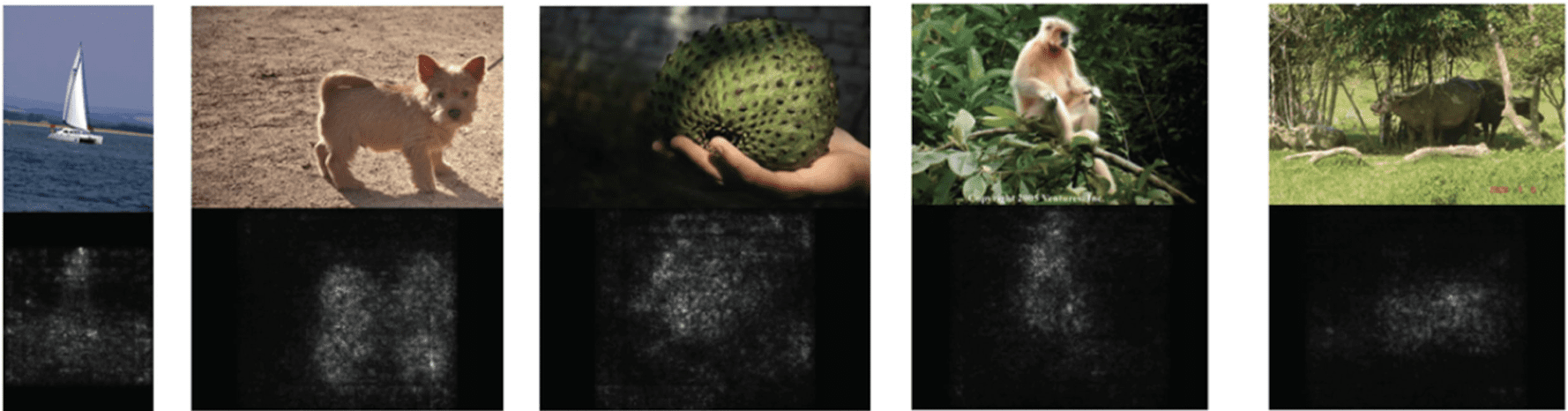
$\mathbf{Fig\ 11.}$ Visualization of saliency map (source: [4])
Guided backpropagation
Despite saliency maps roughly show us which pixels are contributing more to the task, the visualization is a little bit noisy and obfuscating. Springenberg et al. propose a techinique called guided backpropagation for more easily intercriptable visualization.
The reason that saliency maps are not highly clear is because every pixel indeed contributes to the classification in some degree. To make these contributions bit more sparser, we employ ReLU switch to the backpropagation i.e. backpropagate only positive gradients through each ReLU. And such a modified backpropagation is referred to as guided backprop.
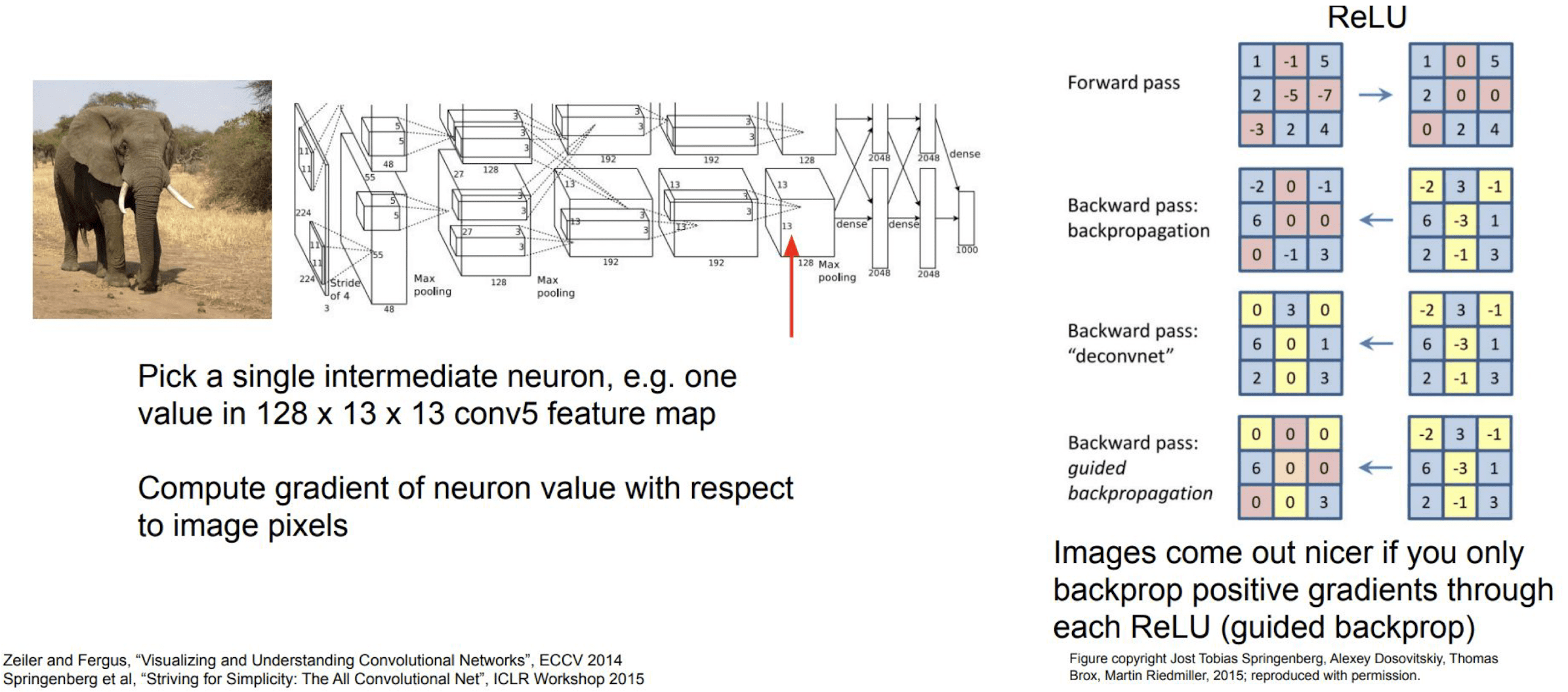
$\mathbf{Fig\ 12.}$ Intermediate features via guided backprop (source: [1])
The following guided backprops show the gradients corresponding to the given maximally activating image patches.
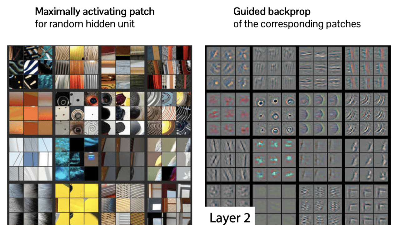
$\mathbf{Fig\ 13.}$ Example of guided backprop with respect to corresponding image patch (source: [1])
As we expect, as the layer goes higher, more meaningful patterns emerge. And it also allows bigger deformation due to the spatial abstraction in pooling:
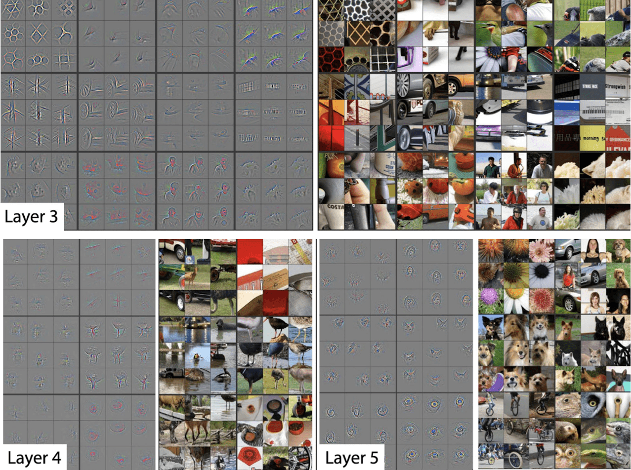
$\mathbf{Fig\ 14.}$ Examples of guided backprop with respect to corresponding image patch (source: [1])
Limitation
So far we discussed about how we can visualize the learned filters or features in the neural network.
And as examples we discussed about activation map, maximally activating patches, saliency map and guided backprop.
Based on the visualization, we confirmed some of the claims that the neural network learns the hierarchical abstraction:
- The higher layer captures semantically more meaningful and high-level visual features
- Certain hidden units are learned to be activated on meaningful object parts (face, legs, etc.)
However the problem of these approaches are that they are based on the examples so that it shows how the network understands specific examples and we have to feed the input to the network for analysis.
Can we let the model “synthesize” the examples that maximize the specific features?
Activation Maximization
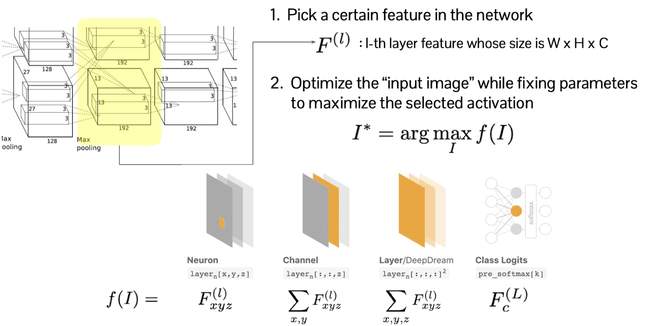
We want to visualize what is trained in the neural network via more direct manner, without feeding the extra examples. And we will discuss about the technique of visualization by the activation maximization.
First of all, select certain layer $l$ and feature of that layer, let $F^{(l)}$. Then we optimize the input image $I$ so as to maximize the activation of selected layer $f$ but with fixed parameter. In other words, $f(I) = F^{(l)}$.
In this procedure, $F^{(l)}$ can be selected in any different manners, for example it can be one pixel of the feature map, of channel, etc.
$\mathbf{Fig\ 15.}$ Activation Maximization
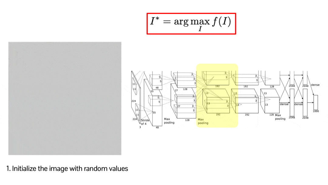
This optimization may be a little bit weird, but it is simply implemented by backpropagation. This visualization shows how the random image is optimized to maximize the score of the selected activation. The result is credited by Audun M. Øygard.
$\mathbf{Fig\ 16.}$ Activation Maximization by backpropagation
The problem is that the generated images are very noisy and less realistic.
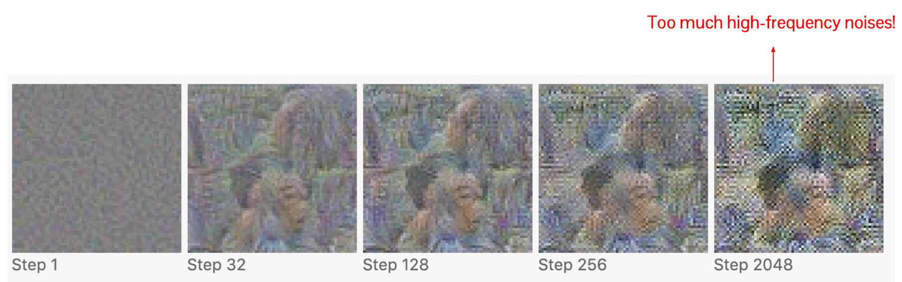
$\mathbf{Fig\ 17.}$ Noisy results of activation maximization (source: Chris Olah Alexander Mordvintsev Ludwig Schubert)
The noise is basically high-frequency patterns in the pixel. If the value of the pixels are changing too frequently between the nearby pixels, it often obfuscates understanding of the image.
The way that we eliminate this high frequency noise is by adding the regularization term that constraints images looking realistic and smooth.
where examples of $R(I)$ are
- $L_2$ normalization $\sum_{x, y} I_{x,y}^2$
- Total Variation $\sum_{x, y} \left( (I_{x, y+1} - I_{x, y})^2 + (I_{x + 1, y} - I_{x, y})^2 \right)^2$
with some additional techniques to remove noises:
- Periodically blur images by low-pass filtering (e.g. Gaussian filter)
- Clip too small pixel values to zero
- Clip too small gradients to zero
As a result, if we optimize the random image to maximize certain class scores with the regularization and visualize it, it gives us more interpretable structures. Since gradient ascent may converge to the local optima, therefore depending on the initialization, optimization will lead to slightly different result image.
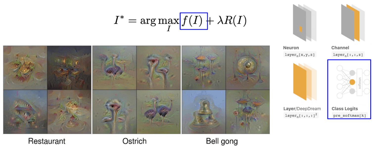
$\mathbf{Fig\ 18.}$ Results of activation maximization of class logits with regularization
And if we just select a certain pixel of a certain layer for maximization, we reconfirm that higher layers captures more high level semantics. As it goes to the deeper layers it captures more larger structures but at the same time, it attempts to discover some class specific features.
$\mathbf{Fig\ 19.}$ Results of activation maximization of neurons with regularization
DeepDream
If one sets the entire layer itself as $F^{(l)}$, in other words, $f(I) = \sum_{x, y, z} F^{(l)}_{xyz}$, this kind of idea of maximizing every activation in the certain layer is called DeepDream.
In DeepDream, we initialize $I$ with real image instead of random values. And by filling this image through optimizing a certain layer, it turns into some sorts of dizzy image as follows:
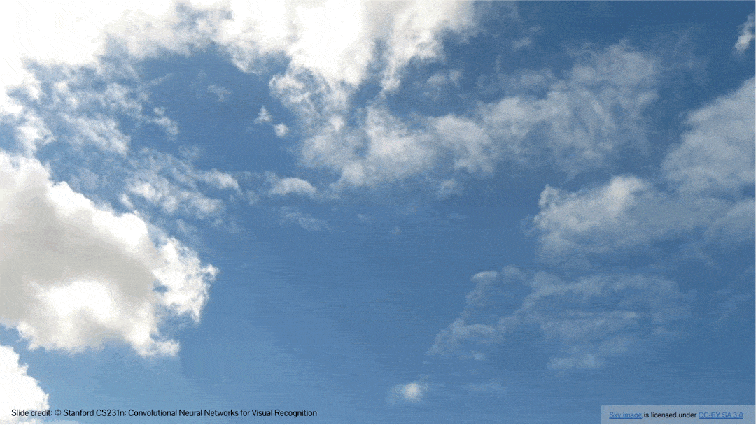
$\mathbf{Fig\ 20.}$ DeepDream of sky image (source: [1])
As it maximizes the entire features, we can see a lot of different and unrealistic concepts in this image:
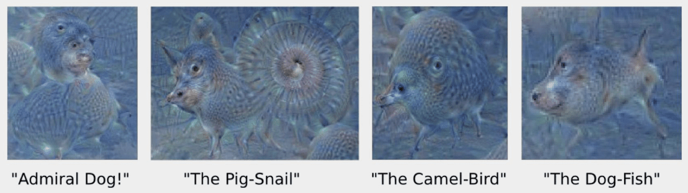
$\mathbf{Fig\ 21.}$ Animals in DeepDream (source: [1])
Visualization via Attention
Classification Activation Mapping
Thus far, we discussed about some optimization-based methods for understanding the neural network representation. And we confirm that they are quite useful for understanding network representation.
However, regardless of necessity of examples for visualization, the common limitations of such optimization-based methods are:
- Synthesizing an image through optimization requires expensive computation (backpropagation)
- Implemented as an independent procedure with the model's work
Then, can we combine these two a little bit more tightly? In other words, can we integrate visualization to the classifier?
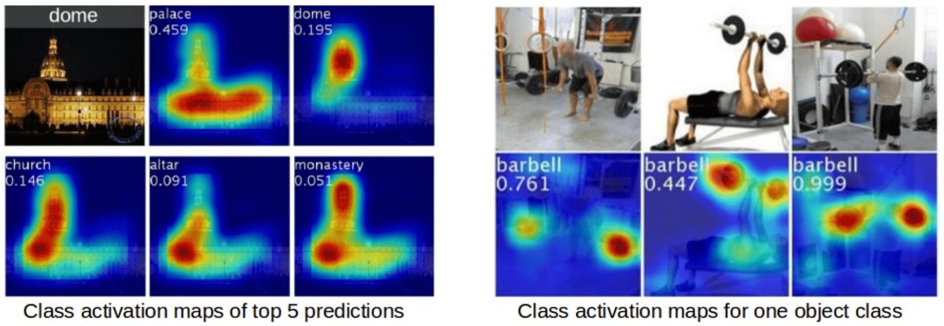
Attention mechanism allows us to visualize the importance of image regions for classification by a single forward pass.
$\mathbf{Fig\ 22.}$ Visualization via Attention (source: [5])
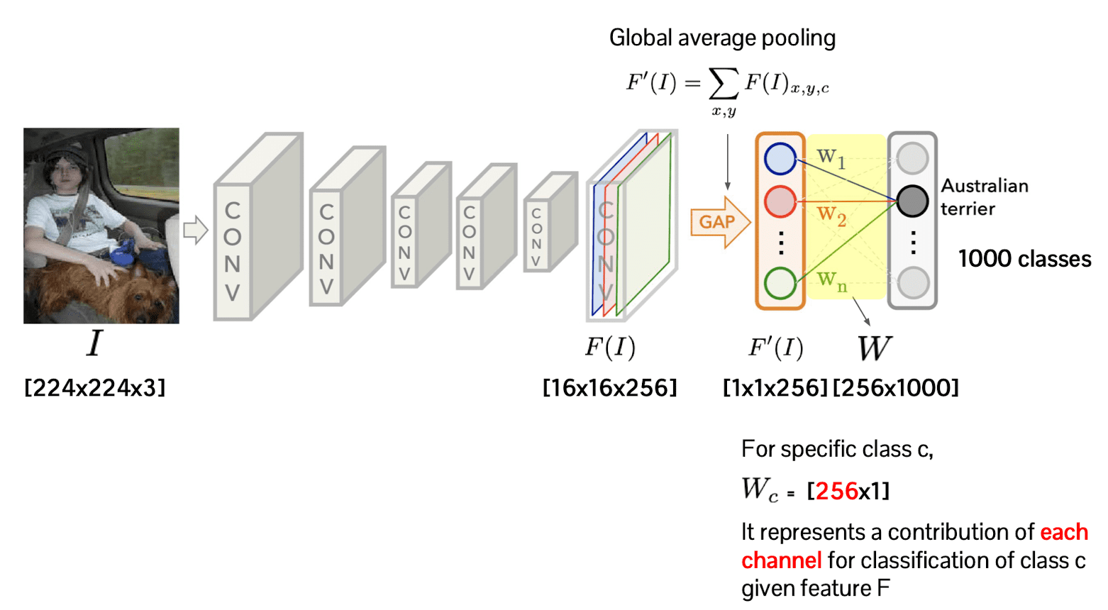
Let the number of classes for classification be $1000$ and the channel of the last feature of convolutional network be $256$. Then the weight matrix of linear classification head size will be $256 \times 1000$.
(For simplicity, suppose that the linear classification head is single fully-connected layer)
Then, each column of this weight matrix $W_c$ corresponds to the projection of the feature map into the certain class $c$. And it is a direct indication of contribution of each channel for classification given feature.
So as to exploit this fact for our visualization, we take the weighted average of each channel of the feature before global average pooling, $F(I)$, with weights $W_1, \cdots W_{1000}$:
$\mathbf{Fig\ 23.}$ Class activation mapping (source: [5])
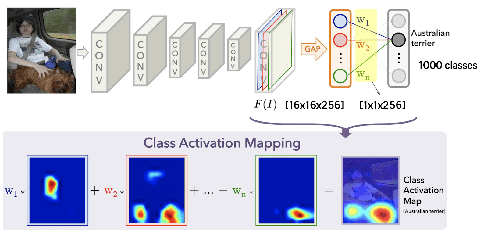
Then this weighted average will give us some insight about which area of the images are contributing for classification. And this procedure is referred to as class activation mapping method.
$\mathbf{Fig\ 24.}$ Result of class activation map (source: [5])
Reference
[1] Stanford CS231n: Deep Learning for Computer Vision
[2] UC Berkeley CS182: Deep Learning, Lecture 9 by Sergey Levine
[3] Yosinski, Jason, et al. “Understanding neural networks through deep visualization.” arXiv preprint arXiv:1506.06579 (2015).
[4] Simonyan, Karen, Andrea Vedaldi, and Andrew Zisserman. “Deep inside convolutional networks: Visualising image classification models and saliency maps.” arXiv preprint arXiv:1312.6034 (2013).
[5] B. Zhou, A. Khosla, A. Lapedriza, A. Oliva, and A. Torralba. Learning Deep Features for Discriminative Localization. CVPR’16 (arXiv:1512.04150, 2015).
Leave a comment