
[ML] Evaluation Methods
The performance of machine learning algorithms can be evaluated in terms of
- Accuracy
- Confusion Matrix
- etc.
But why do we need metrics instead of training objectives such as MSE loss? Metrics usually help help capture a business goal into a quantitative target. And there are some useful metrics that are intuitive and easily interpretable to human like accuracy, but if they are not differentiable, it’s not available to employ them as objectives.
Hence, we also quantify our model by not only loss function but also metrics during training and testing.
Confusion Matrix
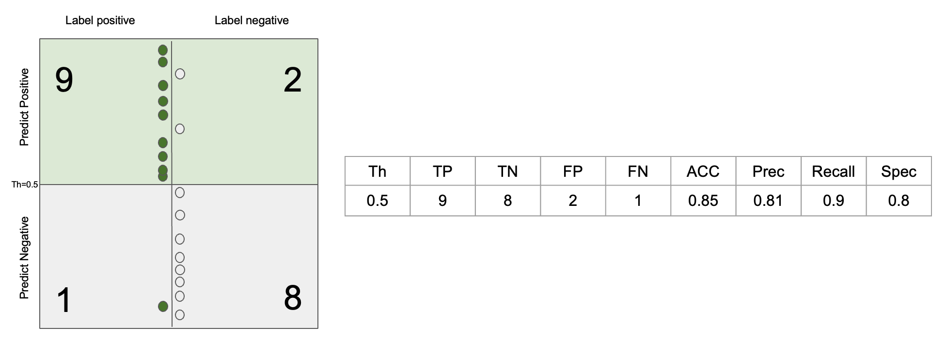
Confusion matrix captures all the information about a classifier performance. Each column of the matrix represents the instances in a true class, while each row represents the instances in a predicted class, or vice versa. Both alignments are usually employed interchangeably. The name stems from the fact that it makes it easy to see whether the system is confusing two classes (i.e. commonly mislabeling one as another). Quality of model & selected threshold decide how columns are split into rows, and we want diagonals to be “heavy”, off diagonals to be “light”.

FP and FN also called Type-1 and Type-2 errors.
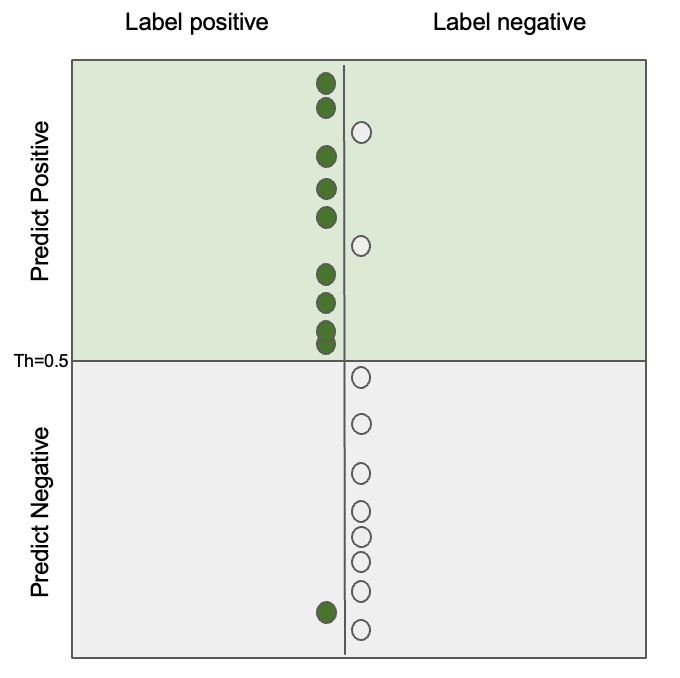
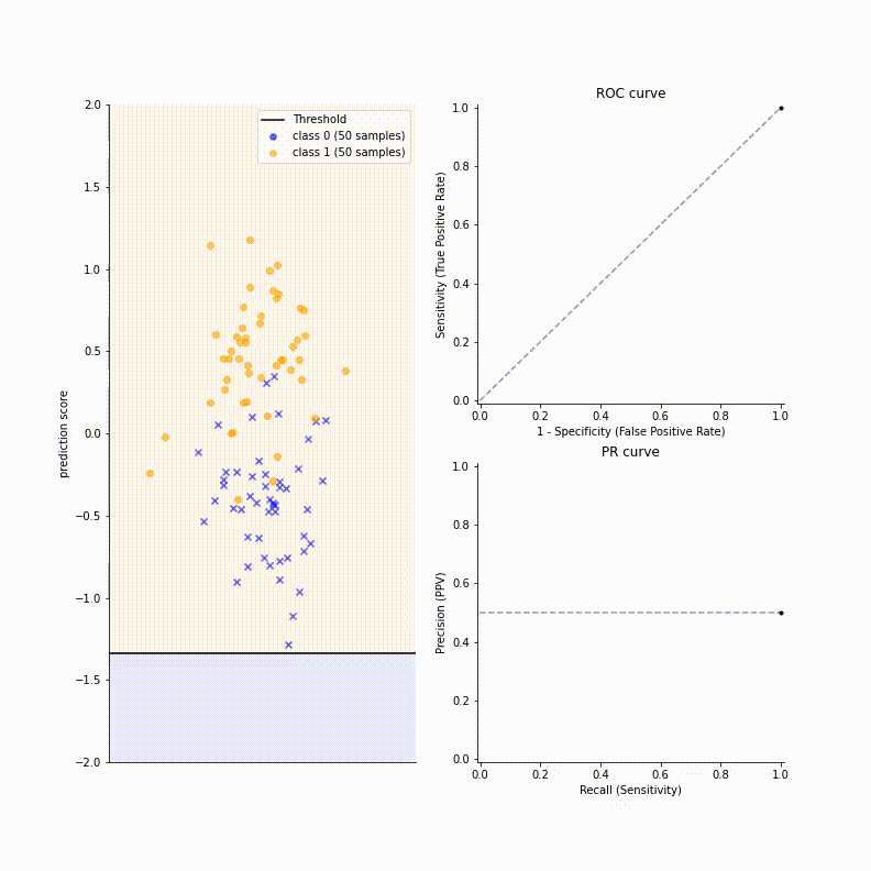
For visualization, let’s consider the following problem of dot classification:
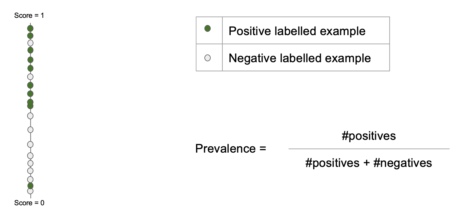
Here, prevalence decides class imbalance. And just consider score to be probability output of logistic regression. Position of dots on scoring line based on this score, thus if score is larger than 0.5, the model classifies the input dot as positive. Then, we can visualize confusion matrix of the problem as below:
Error Rate (ERR)
\[\begin{aligned} ERR = \frac {FP + FN} {TP + TN + FN + FP} = \frac {FP + FN} {P + N} \end{aligned}\]Accuracy (ACC)
\[\begin{aligned} A = \frac {TP + TN} {P + N} = 1 - ERR \end{aligned}\]Precision (PREC), or Positive Predictive Value (PPV)
Precision indicates quality of positive predictions. In other words, it means “of all the predictions that the computer said positive, how much did the computer get right?”.
\[\begin{aligned} PREC = \frac {TP} {TP + FP} \end{aligned}\]Recall, Sensitivity, or True Positive Rate (TPR)
Recall indicates “of the actual positives, how many correct answers did the computer get?”. Or, it is usually called sensitivity from lab tests: how sensitive is the test in detecting disease?
\[\begin{aligned} TPR = \frac {TP} {TP + FN} = \frac {TP} {P} \end{aligned}\]Negative Recall, Specificity, True Negative Rate (TNR)
Negative recall, or Specificity indicates “how specific can model say that it’s negative?”.
\[\begin{aligned} TNR = \frac {TN} {TN + FP} = \frac {TN} {N} \end{aligned}\]Calculating the metrics so far is as follows.
False Positive Rate (FPR)
\[\begin{aligned} FPR = \frac {FP} {TN + FP} = 1 - TNR \end{aligned}\]$F_1$ Score
We can see that recall is somewhat related to precision as both recall and precision involve TP. Indeed, there is a trade-off tendency between precision and recall.
-
If we use a wider net (using a relaxed threshold for classification), we can detect more positive cases (i.e., higher recall), but we have more false alarms (i.e., lower precision).
-
For instance, if we classify everything as positive, we have 1.0 recall but a bad precision because there are many FP.
-
If we adjust the threshold more strict so as to get a good precision, we classify more truely positive data as negative, resulting in lower recall.
Here is an example that we can observe such trade-off relationship:
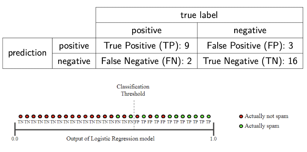
$\color{green}{\mathbf{Example}}$: Spam or not?
This example is brought from here.
$PRE = \frac{8}{8+2} = 0.8, REC = \frac{8}{8+3} = 0.73$

But, if we loose the threshold, we can observe the trade-off:
$PRE = \frac{9}{9+3} = 0.75, REC = \frac{9}{9+2} = 0.82$
But, two metrics are both important for measuring the performance. It is also possible that in the real case, you may assess that the errors caused by FPs and FNs are (almost) equally undesirable. Hence, one may wish for a model to have as few FPs and FNs as possible. Put differently, you would want to maximize both precision and recall.
To consider both metrics, $F_1$ Score combines precision and recall into a single score, defined by the harmonic mean of them. Recall that the harmonic mean is the reciprocal of the arithmetic mean of the reciprocals of the data.
\[\begin{aligned} F_1 = \frac {2 \times PRE \times REC}{PRE + REC} = \frac {2 \times TP}{2 \times TP + FP + FN} \end{aligned}\]Note that the harmonic mean of 2 numbers tends to be closer to the smaller of 2 numbers, so $F_1$ is high only when both precision and recall are high.

Why Harmonic Mean?
It’s because, harmonic mean penalizes unequal values more and harmonic mean punishes extreme values. Let’s look at the 3D scatter plot which compares the behaviors of three means against sets of precision & recall.

You can rotate the chart at here. We observe that harmonic & geometric means move away from the arithmetic mean when precision and recall are not equal. (Red dots form a 2D plane, unlike the blue & green dots form curved plane). And, the more different precision and recall values are, the lower the harmonic mean than any other means. The plane consists of blue dots is much curved than those for geometric means.
As we scan through all possible effective thresholds, we explore all the possible values the metrics can take on for the given model:
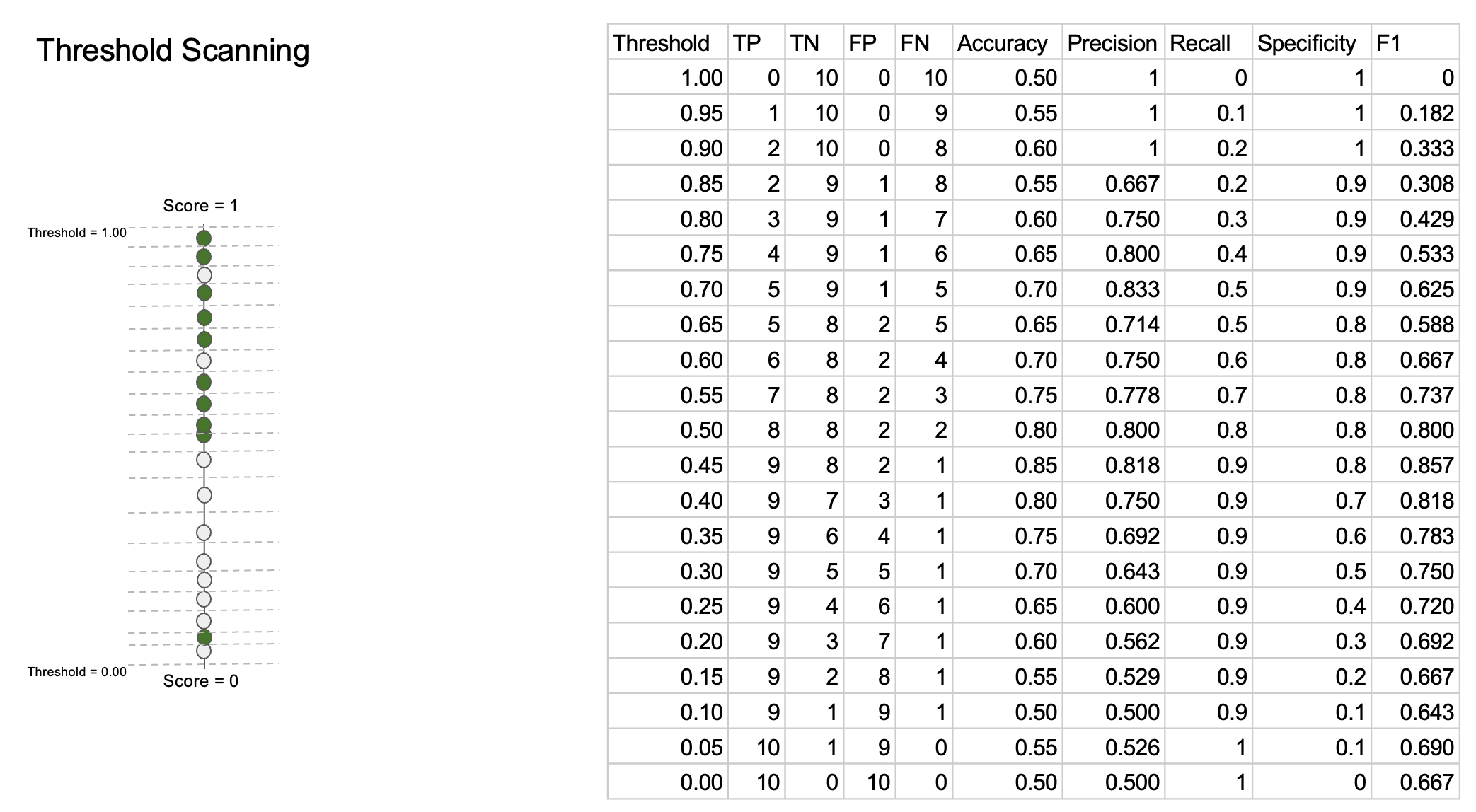
One can observe that monotonicities of sensitivity and specificity are opposite each other. Also, trade-off between recall and precision appears in the table clearly.
ROC Curve
We see that it is easy to realize trade-off between metrics when we scan through thresholds. Like this, we want to summarize the trade-off so that summarize the overall model performance. A receiver operating characteristic curve, or ROC curve, is a graphical plot of TPR against FPR at various threshold setting that summarizies the performance of a binary classifier. As FPR is related to specificity (FPR = 1 - specificity), it contains trade-off relationship between sensitivity and specificity.
To draw a plot, you just scan through the threshold and dot a point corresponding to the two values. Hence if you have a model that randomly (uniformly) assigns probabilities to examples, then the ROC curve will fall along $y = x$ diagonal line. If your model has an ROC less than this diagonal line, it means your model is basically doing worse than random guessing. But, if it is doing like really low than diagonal line, it may be good news because we can get high ROC curve when we just flip the labels.
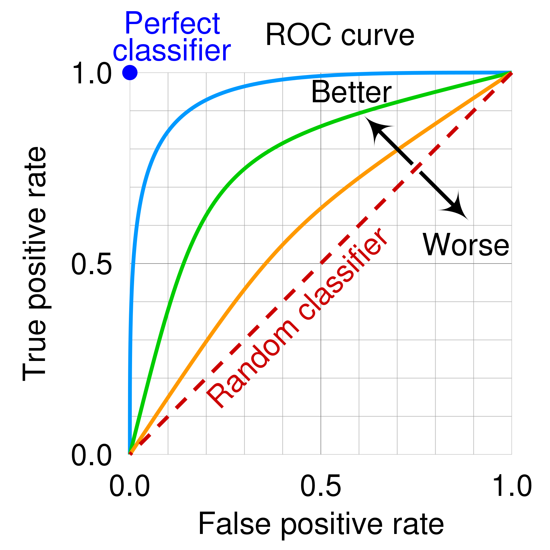
The quality of a ROC curve is often summarized as a single scalar.
Area Under the Curve (AUC)
One summary statistic is to represent the ROC curve using the area under the curve or AUC. It is also called C-Statistic (concordance score), or AUROC (Area Under the ROC) more precisely. You can guess that higher AUC scores are better and the best is 1 clearly from the ROC curve in the previous section.
Or, we can understand this statistic with some equivalent intuitive interpretations. AUC is equivalent to probability that the positive sample will be ranked higher than the negative sample, in other words the score of the positive sample output by our model will be larger than the score of negative sample, if you randomly sample a pair of a positive and a negative example.
Equal Error Rate (ERR)
Another way is equal error rate (EER), or cross-over rate (CER). It is defined as the value of FPR which satisfies FPR = FNR. As FNR = 1 - TPR, we can obtain ERR by drawing a TPR = 1 - FPR graph and observing the intersection of the curve and this line as following figures: see points A and B
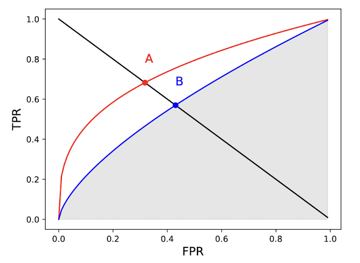
That’s the reason why we call EER as cross-over rate CER.
This summary statistic makes sense when the cost of a FN is equal to the cost of a FP. Think about security system, which must block unknown people not registered in the server, but also simultaneously available for registered users too. Hence, lower EER scores are better obviously.
Precision-Recall Curves (PRC)
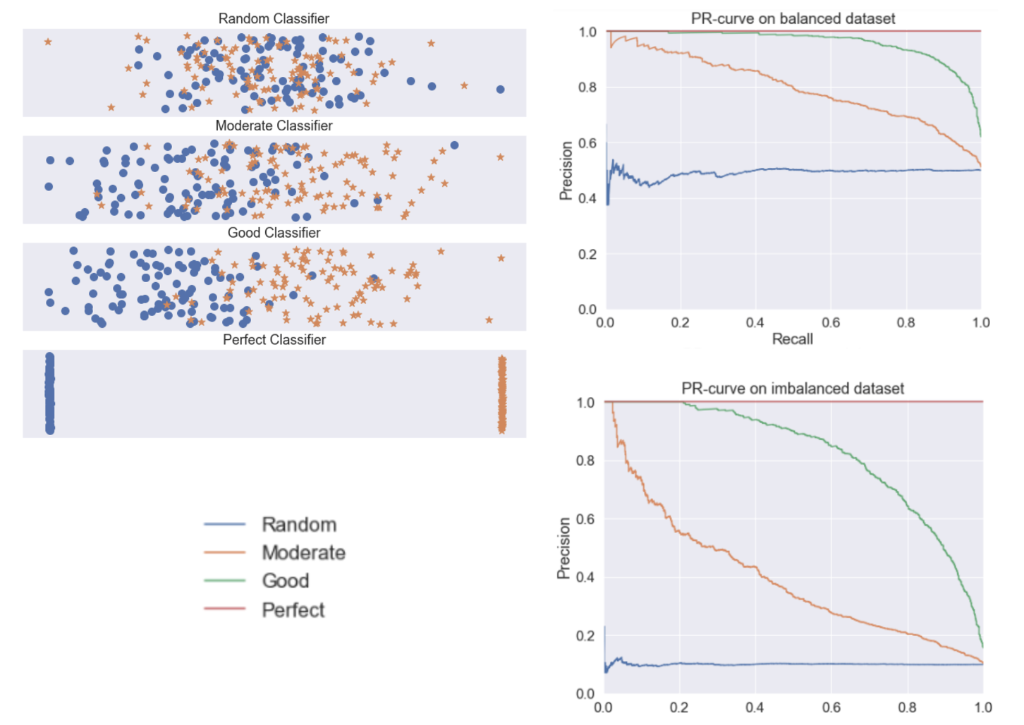
In some cases, there is severe class imbalance. For instance, when you are searching the Internet or in related field of information retrieval, the number of irrelevant items (negative samples) is usually much larger than that of relevant items (positive samples). The ROC curve may be unaffected by class imbalance, as the TPR and FPR are fractions. But ROC curve may be unuseful and can be misleading in some cases as a large change in FPs will not change the FPR very much when number of negative samples are very large.
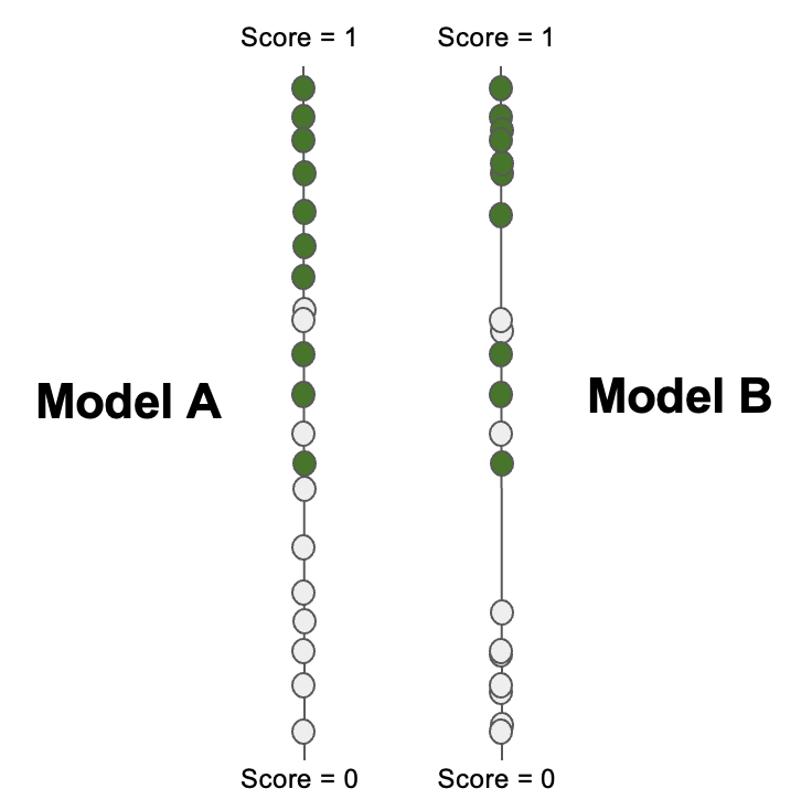
For example, let’s consider the case of a dataset which has 10 positives and 100,000 negatives. We have positive predictions from 2 models:
- Model $A$: 891 FPs, 9 TPs
- Model $B$: 81 FPs, 9 TPs
Obviously, model $B$ is much better than model $A$. In other words, Model B is more “precise”. However, TPR of both model doesn’t reflect this order that much:
- Model $A$: $TPR = 9/10 = 0.9$ and $FPR = 891/100000 = 0.00891$
- Model $B$: $TPR = 9/10 = 0.9$ and $FPR = 81/100000 = 0.0081$
Since the number of negative samples largely prevalent than positive samples, the difference of FPR between both models nearly disappears. ROC curves are showing an optimistic view of models on datasets with a class imbalance!
However, ROC curves can present an overly optimistic view of an algorithm’s performance if there is a large skew in the class distribution. […] Precision-Recall (PR) curves, often used in Information Retrieval, have been cited as an alternative to ROC curves for tasks with a large skew in the class distribution.
The Relationship Between Precision-Recall and ROC Curves, 2006.
In such cases, we usually choose other ways such as precision-recall curves (PRC), which represents a different trade-off with ROC curve. To see the reason why PRC is much sensitive to class imbalance, let’s define the ratio of two classes $r = P / N = \pi / (1-\pi)$ where $\pi = P / (P+N)$ is the fraction of positives in the dataset. The precision can be written as in terms of $r$:
\[\begin{aligned} PREC = \frac{TP}{TP + FP} = \frac{P \cdot TPR}{P \cdot TPR + N \cdot FPR} = \frac{TPR}{TPR + \frac{1}{r} FPR} \end{aligned}\]Hence $PREC \to 1$ as $\pi \to 1$ or $r \to \infty$, and $PREC \to 0$ as $\pi \to 0$ or $r \to 0$. It implies the overall precisions for all threshold will be shifted as $r$ changes. The following figure visualizes such a shift of various models on balanced and imbalanced dataset. For more discussion, refer to this blog post by Tung.M.Phung.
But it doesn’t mean that we always have to employ PRC instead of ROC for imbalanced dataset. To my knowledge, it really depends on the context. For example, PRC doesn’t consider TN, hence it reflects more about positive labels than negatives. So if you have to weight both classes equivalently, it may be not that useful. Also, the “baseline curve” (i.e. performance of a random classifier) in a PRC plot is a horizontal line with height equal to the number of positive examples $P$ over the total number of data $N$, in other words $y = \frac{P}{P+N}$. As it fluctuates for different datasets, it may hamper the comparison between models harder.
$\mathbf{Proof.}$ The baseline curve of PRC is horizontal line.
Let $\tau \in [0, 1]$ be given threshold. Then, a random classifier will choose $\tau \cdot (P + N)$ number of data to be positive, i.e. $TP = \tau \cdot P, FP = \tau \cdot N$. Then,
Hence for any $\tau$ in $[0, 1]$, PREC is fixed to $\frac{P}{P + N}$.
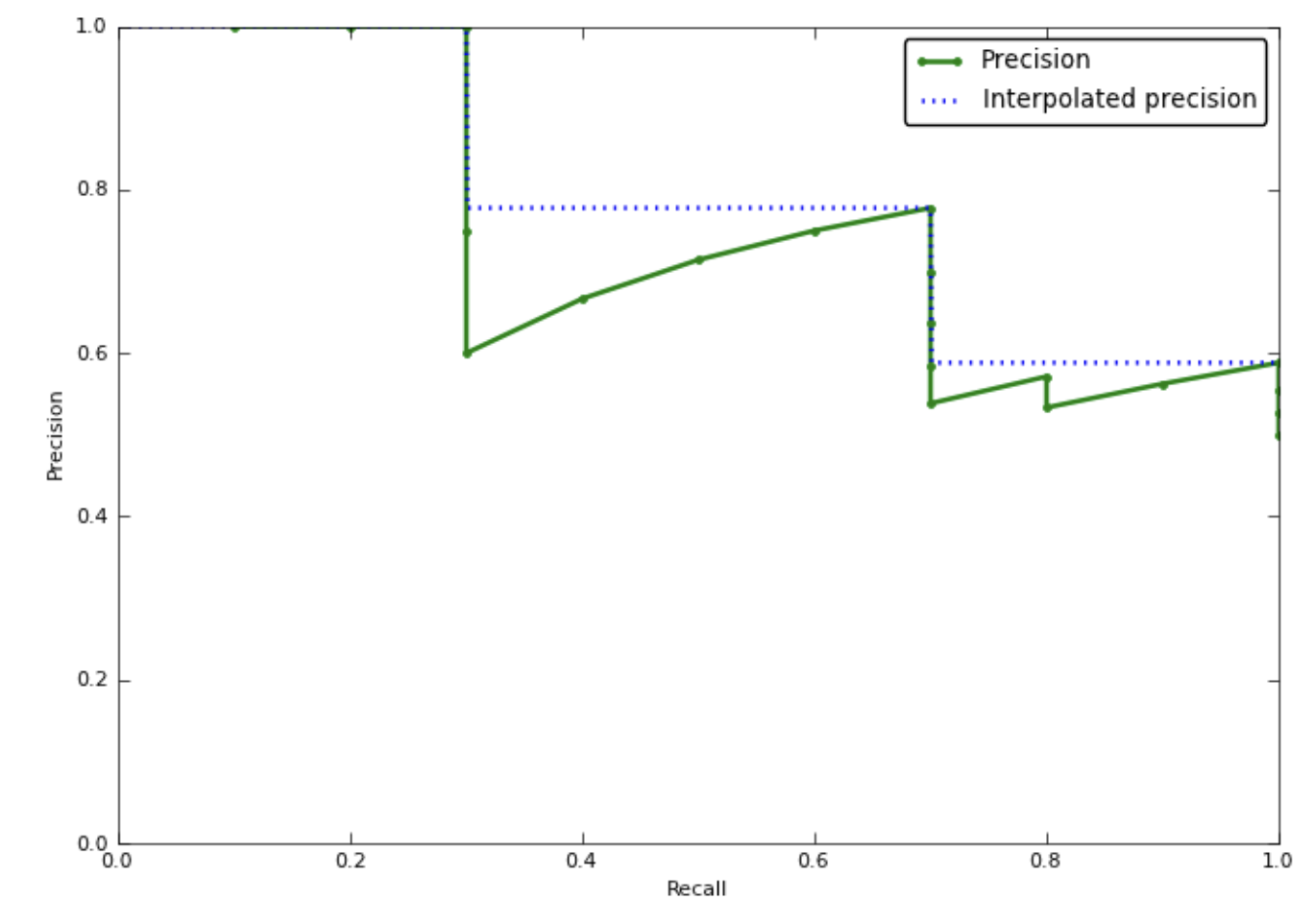
The way to draw a curve is exactly the same as ROC curve, by scanning the threshold from 0 to 1 and dotting appropriate point of precision (y-axis) and recall (x-axis). Reaching the top right corner is the best one can do. Refer to the following GIF for your understanding:
One thing to note is when PRC reaches REC = 1, i.e. threshold is 0, PREC will be exactly equal to the prevalence $\frac{TP}{TP + FP} = \frac{P}{P + N}$.
Average Precision (AP)
Likewise, PRC can be summarized with several single scalars. One can think about area under PRC, but it may not work as intended since precision is not often monotone with regard to recall.
Consider a model that has 80% precision at 50% recall, and 85% precision at 60% recall. Instead of measuring the precision 80% at a recall of 10%, in this case we can measure maximum precision that is better at least than a recall of 50%. (In this case, it will be 85%). It is called interpolated precision. Image credit by this blog post.
Then as PRC is monotone, we can compute the area under the interpolated PRC, i.e. average of the interpolated precisions, and it is called the average precision (AP).
mean Average Precision (mAP)
The mean average precision (mAP) is the mean of the AP over a set of different PR curves. For example, in multi-label classification problem, we usually compute AP for each class and evaluate models by taking an average of them, i.e. computing mAP.
Calibration Curve
So far, we have looked into some evaluation metrics and curves which are based on confusion matrices. Consider the following two models scoring the same dataset. Is one of them better than the other? Even they have exactly equal ranking-based metrics, somehow the second model feels better.
The metrics so far fail to capture such a certainty of the model predictions. In this context, we need another approach for evaluation methods can be used to characterize how consistent and confident the predicted class probabilities are.
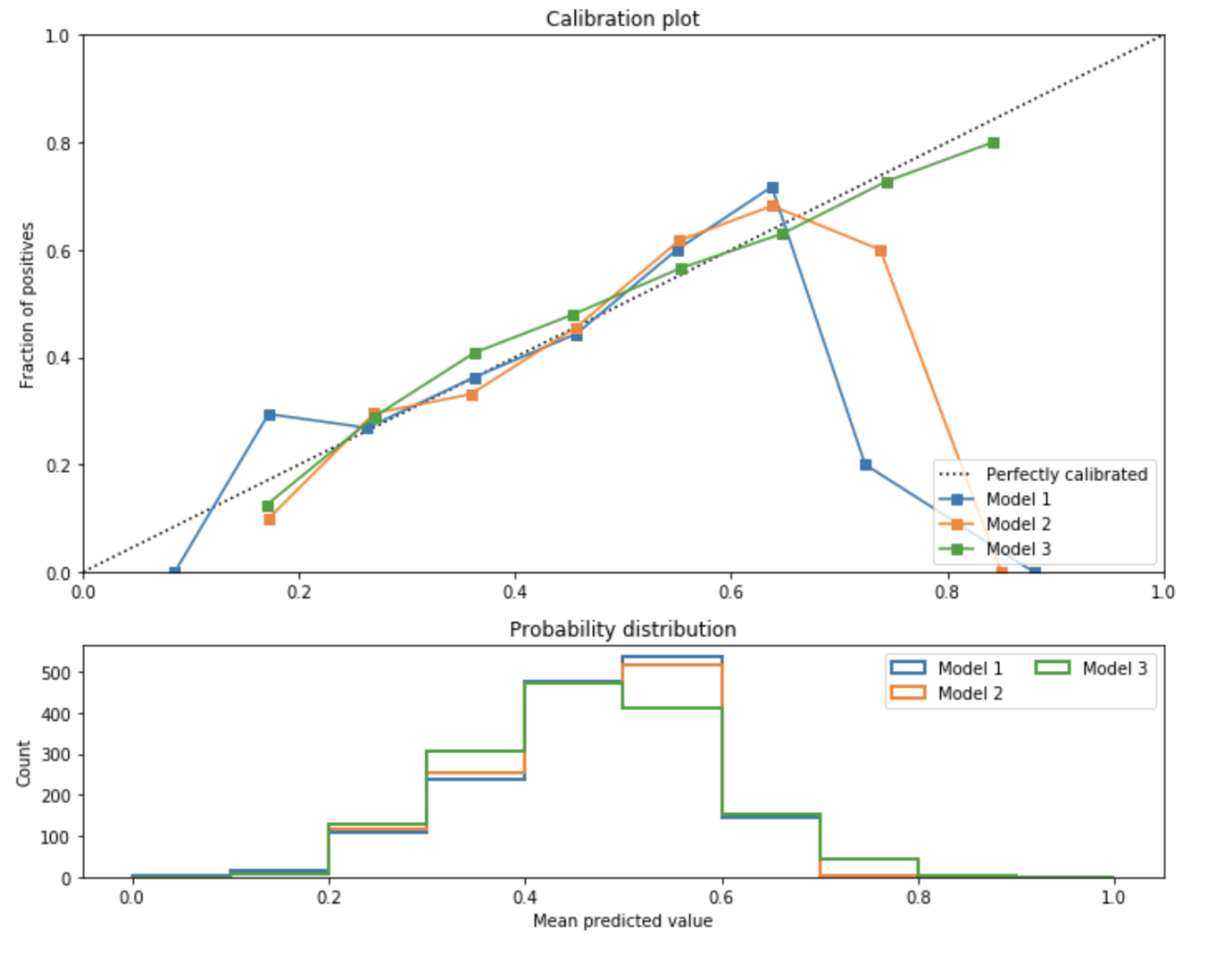
A calibration curve, or reliability diagram is a plot that shows how the probabilistic predictions of classifier are well calibrated, i.e. how the probabilities of predicting each class label differ. In y-axis, it plots the frequency of the positive label, which is an estimation of the conditional probability, and in x-axis it plots the predicted probability of a model. To make a long story short, it plots the actual frequency against the predicted frequency. To plot the curve, we collect each prediction into interval of probabilities that its predicted probability falls into. And then count the empirical frequency of samples whose predicted frequency is contained in that interval.
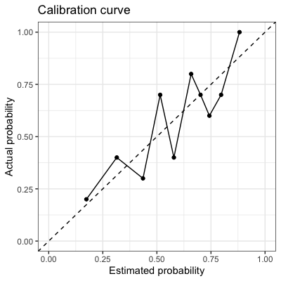
A perfectly calibrated model would have a calibration curve following the diagonal $y = x$. If the curve of a model is below the diagonal, i.e. $y < x$ the model is overconfident. Otherwise, the model is underestimating that outputs lower probabilities than it should.
Furthermore, when we plot the calibration curve, we often provide the histogram together that shows the number of samples in each predicted probability bin.
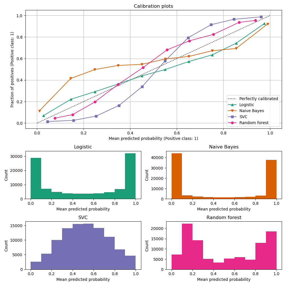
It is somewhat important to see these two plots (calibration curve and histogram) in conjunction, as calibration doesn’t necessarily mean accuracy at all. We can have a perfectly calibrated plot, but most of assigned probabilities might be just concentrated around 0.5, not two peaked like these models:
Log loss
Uniformly, calibration curves also have some quantitative measures that summarize the graph. Log loss is the negative average of the log of corrected predicted probabilities, which corresponds to cross entropy loss in machine learning. For binary classification,
And for multi-label classification,
Brier score
Brier score is MSE between the predicted probability and the ground truth label.
For binary case,
And it can be further extended to multi-class case:
\[\begin{aligned} \frac{1}{N} \sum_{i=1}^N \sum_{j=1}^K\left(p_{i j}-y_{i j}\right)^2 \text{ where } y_{i j}= \begin{cases}1 & \text { if } j=k \\ 0 & \text { otherwise }\end{cases} \end{aligned}\]where $K$ is the number of classes, and $y_{ij}$ is $1$ if the true label $k$ of the $i$-th instance is the class $j$ and $p_{ij}$ is the predicted probability of the $i$-th data belonging to class $j$.
Since brier score measures the confidence of model, even two models have exactly same ranking metrics, brier score may be very different like in this example:
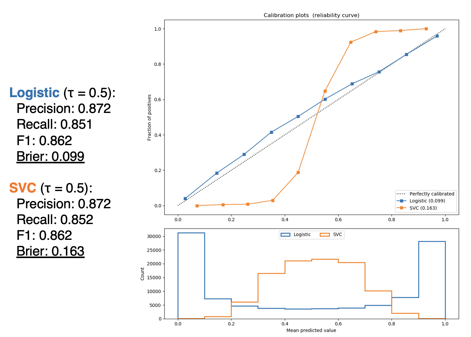
But as we saw in the figure of calibration curve and histogram, a lower Brier score (and also lower log loss) isn’t always a good sign as it is not clear which term dominates. In class imbalance case, for instance, majority class may dominate the score.
Reference
[1] Stanford CS229, Lecture 21 - Evaluation Metrics by Anand Avati
[2] Wikipedia, Confusion matrix
[3] Wikipedia, Receiver operating characteristic
[4] Kevin P. Murphy, Probabilistic Machine Learning: An introduction, MIT Press 2022.
[5] StackExchange, What does AUC stand for and what is it?
[6] Precision-Recall Curve is More Informative than ROC in Imbalanced Data: Napkin Math & More
[7] StackExchange, What is “baseline” in precision recall curve
[8] João Gonçalves, Can You Trust Your Model’s Probabilities? (Part I)
[9] scikit-learn User Guide - Probability Calibration
[10] Using Calibration Curves to Pick Your Classifier
Leave a comment